Design skills for public relations majors are arguably more important now than they have ever been. When searching for necessary skills among public relations professionals, design or creativity tends to be a common theme. This article from The Balance Careers details the many skills needed by PR professionals, including communication, social media, research, time management and many more. Some of these “others” include creativity, branding, graphic design, and adobe creative suite.
In an article on Ragan, the first skill listed in the “7 essential skills for today’s PR pro” was graphic design. The second was visual content. From there social media and blogging make an appearance, and the article finishes on HTML.
All of this is to explain that public relations is a changing field. Now more than ever, the most valuable employees are the most well-rounded. While it’s imperative for a public relations professional to connect with clients and publics (that is their job, after all) the digital age of marketing includes many more ways to reach those clients and publics. Websites and website content are incredibly important, and aesthetic is increasingly important to the up-and-coming generations.
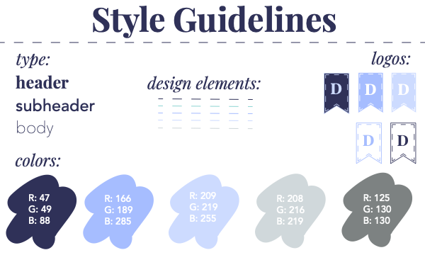
This article from AllTopStartups lays out the necessity of aesthetic to millennials and how it affects brands. The article lays out the facts: millennials have the same wants and needs (roughly, at least) of the previous generations. What they do not necessarily have, are the financial means to acquire all of what they need, especially as prices rise. Because of this, brands need to fill the gap with aesthetic. Aesthetic does a lot to sway buyers; the cleanliness and utility of a website makes it more trustworthy to the user, the colors used in a campaign or the branding of a product make the consumer feel calm or relaxed, and the images and design elements used regularly by a brand create familiarity among their publics. This is why we create branding suites.

This information makes it even more important for public relations professionals to have an intimate understanding of design and design skills. When a company needs to reach their publics, a PR professional can tell them, through market research, what design elements their publics need to see. If there is little consistency among the company’s social media pages or other sites, a PR professional can explain that their brand is not recognizable.
Of course, when explaining to a brand that they need design help, a professional consultant needs to understand what they are saying and doing. Once a company is paying for your services, it’s your duty to show them examples of what they could be doing differently to gain the traffic that they want. Knowledge of creative suite, HTML and CSS are bridges for a professional to take their vision for a company’s brand and lay it out for them. This way, the company can verify that the imagery fits their brand image and mission statement, and merge these ideas with the cutting-edge aesthetic and efficiency that has become increasingly popular in digital culture. It doesn’t need to be said that it is difficult to give advice on something that you do not, yourself, understand. Visuals are a large portion of company communications to their publics, so PR professionals should know how to read and translate them.


