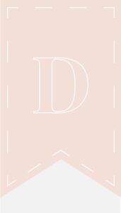
Altogether, I’ve really enjoyed learning about Adobe Illustrator. I tend to have a more simplistic and straightforward vision when it comes to design. While I like to layer and play with shapes and vector masks, I tend to feel overwhelmed by Photoshop. As simple as it is, I really like using the Pen tool. As you know, my logo is a really simple bookmark. It was incredibly simple to use the Pentool to create it, but it looks clean and professional, exactly how I wanted it to look.

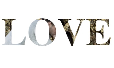
Overall, though, I think one of my favorite design skills has been creating text masks for images. When I was in high school, I was on yearbook from sophomore to senior year. During this period, I had the chance to work with our yearbook editing program, HJEDesign. Since I was editor my last two years of high school, I ended up finishing a lot of our designs. My favorite pages were our senior ad pages, because they didn’t have to fit into any sort of theme with the rest of the book and could be very individual. I ended up using text as an image mask a lot, but mostly because it was a feature through our design program. When I realized I could accomplish this myself, I felt a rush of nostalgia. So, naturally, I watched this video so that I could start working on it myself.
Honestly, this just seems like such a great way to make a design stand out. Like I wrote previously, I tend to like clean designs. Using this strategy, it’s easy to make a title really stand out on a design without giving up a lot of your white space. It reminds me of spring cleaning, when you reallocate all of your belongings and start creating a more efficient storage system. Everything flows better, and you find that a lot of what you have can serve multiple functions. Of course I had to play with it some, as well: 
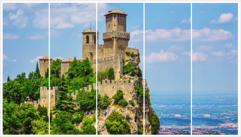
This process speaks to me for a lot of reasons, though. I also tend to really like designs that continue images in different shapes without any real breaks. My best example of that is this, which was part of a slide for a group project last semester:
At the time (and because I was using Google Slides) I just created five different image boxes and put the same image in each, painstakingly lining it up so that the entire image flowed seamlessly. Now, though, I could do the same thing and just fit an image into multiple boxes at once, creating this really simple but eye-catching design. Again, I like the idea of using this as a background and taking the focus there, and really simplifying the rest of the design. It seems like there are so many different ways to play with masks that could create really engaging content without overwhelming the eye.
Obviously, overuse of this would be bad. I can’t imagine many times when I would want to mask image boxes and then mask text over them (although never say never, I suppose), but I feel if this is used correctly, it’s a compelling design tactic.